What an interesting challenge from the DivaCZT this week! She invit
es us to "go back into your own archives and recreate a tile from your past with your present style."
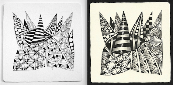
I did some hunting through my digital archives and found three early tiles. Although I can't give you dates for them I'm going to hazard a guess at 2010-2011. Here they are, past and present:
I think I prefer the hanging bulb in the original, but I much prefer Crescent Moon and 'Nzeppel in this re-do.
 |
| Tangles: Crescent Moon, Munchin, 'Nzeppel, and stripes |
I never liked this one much, and I realize that it's because there are no strong darks. Well, that's now remedied.
 |
| Tangles: Flux, Keeko, Paradox, Scoodle |
|
I think this is probably the earliest of the three because - I didn't even realize this until I placed them side by side - there's no shading!
 |
| Tangles: Knightsbridge, Paradox, Pearlz, Pearlz, Pina, Shattuck, Wud, stripes and more |
|
Thanks Diva Laura for yet another fun exercise!


In all three there is so much more contrast and you can see that you really got your own style over time.
ReplyDeleteWonderfuk first tiles, I would be thrilled to do them half as good as this now. the second ones are certainly more polished now though. In your beginner third tile I can see your spire/Narwal interest beginning to emerge :-)
ReplyDeleteVery lovely, I likr it :-)
ReplyDeleteSome time ago, I did som drawings in the same way at my blog.
I love it.
Have a great weekend :-)
It's easy to see that you have latent talent, and a good eye, judging by your earlier tiles, but WOW, did you ever bring life to them with your added experience, in the current tiles. I especially love the highlight in the middle of your crescent moon "blacking" ... do you have a technique for that?
ReplyDeleteHello HeidiSue, yes, I do you have a technique for that although it's a little hard to explain. I guess the best simple explanation is to say crosshatching.
DeleteAll of the tiles are quite beautiful. I love the depth that you get in Nzeppel. Your shading is sublime - a goal I hope to aspire to.
ReplyDeleteIt is so interesting to see the differences--and I appreciate that you shared that in the first one you really like an element of the original tile better than how it showed up in the second tile. I find that it is important to realize that not everything completed in this moment outshines what has come before.
ReplyDeleteI love them all and it's obvious that you are quite an artist. I know what you mean about the contrast really making a difference. I have looked at some of my favorite and unfavorite tiles and in almost all of them, without fail, the ones that are the most pleasing to me are those that have a strong contrast between the lights and darks. I love your revised tiles!
ReplyDeleteHow fun, I love to see your progression. All your work is gorgeous but your shading and contrast adds even more beauty and depth. Thanks for taking us down memory lane :)
ReplyDeleteWhat a difference! Inspirational!
ReplyDeleteThese are so helpful, to see specific points of improvement and evolution. Thank you for all of the great posts over the years!
ReplyDelete