The original answer is 'a newspaper'. (Red. Read. When you hear it you can't tell the difference.)
The Diva this week offers the other popular answer: a sunburned zebra. One could also say 'an embarassed panda' or 'a penguin with a rash'. A darker answer, from my years in elementary school, is 'a nun rolling down a hill' but nuns don't dress like that anymore. Of course, none of these uses the word play of the original answer.
Anyway, that's our challenge this week: create zentangle artwork using the classic black and white, but also add RED!
First, I wanted to try the tangle Maryhill in two colors so this was a perfect opportunity. I used a Bijou tile and it required a lot of changing back and forth between black and red, but the effect is nice. Also in the photo is a bookmark I made a while ago using black and red.
You know art's primary colors of course, red, yellow, and blue. I suspect that black, white, and red is a popular combination because they are primal colors. As languages developed the first color words were words for black and white (or dark and light). The third color word added in any language is a word for red, probably because of its association with blood and life and death.
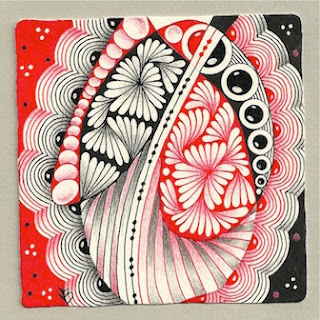
Soooo... back to zentangle. Here's my first full-size tile on this theme. The string seemed to alternate on the two sides, so I decided to try to alternate the two ink colors and the tangles also.
 |
| Tangles: Beadlines, Black Pearlz, Crescent Moon, Ginili, Pearlz (sort of), Ruutz, Tri-dots |
 |
| Tangles: Paisley Boa, elements of Bunzo, and stripes. |
 |
| It Takes a Village (c)2010 Margaret Bremner |


The tile with the blobs is really amazing. The stripes give it a real 3D effect. I love all of your artwork very much.
ReplyDeleteThank you Jeannine.
DeleteVery beautiful!what splendid tiles!!!
ReplyDeleteYou are so great with contrast and the red is no exception! All look fabulous, but of course, my eye was drawn to your Maryhill. That's awesome! Altho I'm working on a couple Maryhill with color versions as we speak, I hadn't thought to split up the color in the tangle! That's a lot of switching back and forth! But I agree with you, nice effect! I also like how the first full size tile has deep contrast but also subtle shades. Cool, cool, cool and cool...as always!
ReplyDeleteThanks Betsy. (Haha! At first I typed Besty!)
DeleteIt was a lot of pen switching, but the main challenge was to connect the two colors at the corners.
Oh my, so beautifule tiles! I love all of them, especially the red coloured shading and the alternating black and red in the second tile and I LOVE your tangle village! It is so inspiring- I need to try it, anyway...
ReplyDeleteBeautiful and inspiring!
ReplyDeleteYour work is always so inspiring Margaret!
ReplyDeleteThank you for the language history--so interesting! These are all so beautiful and balanced. I particularly love the negative space in the bookmark.
ReplyDelete