Showing posts with label artists. Show all posts

Friday, September 20, 2019

Art Terminology


For several years I wrote art-related articles for a local monthly newspaper. A number of readers found this one rather helpful. So even though most of you reading this blog are into art in one way or another, I thought I'd share it here, slightly edited.


ART TERMINOLOGY

Would you visit an art gallery if you knew what the heck they were talking about half the time? Here’s a beginner’s glossary to get you started.

The color spectrum is the whole band of visible color. A rainbow. A hue is the actual color name, like orange or blue. Most of us just say “color”.

If a color has white added to it, it‘s called a tint. ‘Pastel’ colors are all tints.  If a color has been darkened it is called a shade. A color’s value has to do with its lightness or darkness – its tinting or shading. Intensity refers to the color’s brightness.

The picture plane is the two-dimensional flat surface on which the image is placed.

Paintings and drawings are generally done on a flat surface. If artists want to imply depth or distance, they use perspective. Perspective can be created in a variety of ways. 

An early method of trying to imply depth of space was to place distant objects high on the picture plane, and nearby objects at the bottom, even though they were all the same size. Objects can be overlapped; objects behind are missing parts because they're blocked out by those in front. Near objects can be shown larger than distant ones and/or in greater detail. Distant objects can be depicted in muted or grayed colors. In school you may have learned about converging lines and a vanishing point.

Texture can have two similar meanings. It may refer to patterning or other visual aspects which give an implied texture to a flat surface. Or it may refer to actual tactile texture - one you could feel if you touched it.

Impasto is a particularly thick application of paint. It can be done with a brush, but often a palette knife is used. This creates one kind of texture.

A patina (pa-TEEN-a) is the surface appearance and texture of an object. It is usually acquired over time, through contact with elements in the air or soil or human hands. Copper roofs acquire a green patina called verdigris. Wooden handrails become exceptionally smooth, even glossy. It is possible now to speed up or duplicate these finishes to some extent. 

Hatching is shading using a series of fine parallel lines. When a second or third set of lines overlaps the first at a different angle, it is called cross-hatching.

Here’s a good one: chiaroscuro (kee-AR-o-SKOOR-o). It’s Italian. ‘Chiaro’ means clear; ‘oscuro’ means obscure. Mediterranean light is strong, and strong light produces deep shadows. In art, chiaroscuro means pronounced lighted and shaded areas, and using these to show the form of an object.

Collage comes from the French verb coller which means ‘to stick’ or ‘to glue’. Collage simply means gluing things onto the picture plane. An entire picture may be made this way, or only one or two elements may be collaged.

Abstract has become somewhat of a catch-all term for any art that looks sort of weird and “modern” and hard to identify. True abstract art - while it may be difficult to recognize even if you have a good look at it - is nonetheless inspired by, and derived from, recognizable objects. 

If the representation of real objects is completely absent it's called non-objective or non-representational. It is not an abstracted image, but springs entirely from the artist's imagination.

So choose a friend, choose a gallery, and throw a few words around. Have fun!


And because there are no pictures this time, I share this with you. I assumed it was done by an adult with some art training, but no. The artist is five or six years old, accessing her inner compositional genius without even thinking about it!  :)

Thursday, October 31, 2013

Margaritte

It's Hallowe'en here in North America and I want to show you my costume this year. I think it's one of my best!


That's me, dressed up as René Magritte's "Son of Man" painting. If I tilt the hat a little more I can actually see out of my left eye. Negotiating stairs is tricky though. Here's a picture of the original.

Tuesday, August 20, 2013

Montreal vacation

I've been enjoying Montreal for the past two weeks. We're here with a couple of friends who did a house exchange so we have wonderful company and wonderful accommodations. The weather has been beautiful! I'm eating my fill of Montreal bagels (the best), visiting lots of interesting places, and and doing a lot of walking - 9 kms one day! My husband and I lived here for five years B.C. (before children) and our youngest daughter is currently studying here.

I'd prepared a few posts before we left home - most of those have been posted - but today I'm on a computer where I can upload photos and I want to share some pictures from Montreal.

We took a walk through part of the huge cemetery on Mount Royal, looking for two particular grave sites (which we found!), and in our wanderings I saw this wonderful Celtic cross gravestone. I love Celtic interlacing and patterns.

We went to see an exhibition of work by Dale Chihuly at the Montreal Museum of Fine Arts. Eye-poppingly gorgeous!!! He works in blown and molded glass and the works are huge (although composed of small parts). We were enchanted.
Not sure if the title is Sun or The Sun, but it's spectacular!
 Here is my husband in front of it, to give an idea of the scale:
This is but a small portion of a piece that filled an entire room at the gallery
and looks like an underwater landscape. I loved these green and black tendrils.
Part of a large ceiling!
There were pads so you could lie on the floor and look up at it.
I thought it would make a marvelous floor too, to walk over.
One of a series of what he calls 'chandeliers'.
There are also 'towers' that sit on the floor.
I went to a children's class that our daughter facilitates and taught the kids how to draw looped string lotus flowers, which they then colored and put a jewel in the centre. Some of them looked more like stars, which is fine. Mine do that too sometimes!


Tomorrow we're off to Toronto for two days, and will visit the ROM's special exhibit on Mesopotamia.

Saturday, November 24, 2012

Tangle all the things!

I've been wanting to do this for quite some time.

If you're unfamiliar with the somewhat viral "all the things" meme check out this post on the Hyperbole and a Half blog. Why it became so all 'round popular, I'm not sure, but it is. The original version is "Clean all the things" but people have done a lot with this simple phrase and drawing. By the way, a meme, according to dictionary.com, is "a cultural item that is transmitted by repetition in a manner analogous to the biological transmission of genes".

And while you're at it, if you're a grammar and spelling nerd like yours truly you might like this post about Alot.

Tuesday, July 3, 2012

String and nails portraits

Remember that string and nail art you did as a child? Artist Kumi Yamashita has taken that a whole lot further. Amazing work! To see more, see here.

Tuesday, May 1, 2012

360 degree Escher

I've always enjoyed the work of Dutch artist M. C. Escher.  Here is his work "Relativity".

Someone has taken this piece and created a 360 degree video. Have fun traveling around it!

 http://www.360cities.net/image/tribute-to-escher


Tribute to Escher in Barcelona

Sunday, February 19, 2012

Stippling - a tutorial

Stippling is a delicate drawing technique with lovely results. In this technique the drawing is composed entirely of tiny dots. Some very impressive shading can be accomplished this way.

Drawing by Jayel Aheram on Flickr. Image licensed on Creative Commons.

Christine Farmer does a lot of pen and ink work using stippling. You can see examples of her work here. She says, "Stippling as a technique requires precision, skill, and concentration, and I like the fact that progress is necessarily slow and steady." Sounds rather zen, doesn't it?
Noli Novak frequently does illustrations for the Wall Street Journal employing this technique.

Image from Noli Novak's website

Some superb artwork can be created using only stippling. BUT... it can also be used in small amounts. It's a terrific way to achieve an effect in pen and ink that is other than black, white, or lines. Some time ago I tried a very simple Zentangle tile using only stippling. For the string I overlapped two 8s. There is no pencil shading.


CZT Donna Hornsby's tangle Keenees uses tiny dots... basically stippling. When stippling in Keenees you can go darker into the corners, like this:


I thought it would be interesting to do some Zentangle tiles entirely in stippling. I found it has a sort of misty look. I think I could be a little bolder with areas that could be more black. Both these next tiles were done using a 01 pen, with the exception of Zedbra on the left which was done with a 08 just to see the difference. I used pencil for the shading.
Tangles: Florez, Keenees, Lotus Pods, Tripoli, Zedbra.
Tangles: Dutch Hourglass, Flukes, Flux, Miranda, Paradox

Next, I tried a normally-drawn tile, but did all the shading using stippling. I still much prefer the effect of pencil, but stippling can be a good option for shading should you find yourself with only a pen.
Tangles: Cubine, Golven, Hibred, Pearlz, Unyun and stippling

HOW TO?
Simply use your Sakura Micron (or similar) pen, hold it vertically (not slanted) and with a light touch tap the pen tip on the paper. Many, many, many, many, many times. :-)
More dots in one place gives darker areas. Fewer dots, lighter areas. You can use different sizes of pen for varying effects. If an area is to be quite dark you may want to begin with a larger pen to fill space faster, then switch to a tiny pen for finishing.

There is a little more about stippling from Canadian CZT Geneviève Crabe on tanglepatterns.com here.

Finally, here's a two minute video showing the development of a portrait done entirely in stippling. Prepare to be amazed!


Hero from Miguel Endara on Vimeo.

Wednesday, December 28, 2011

Strings of fire

Etsuko Ichikawa uses molten glass to create black and gray lines on white paper. Stand-alone Zentangle strings! You can read and see more about her here.

Friday, July 1, 2011

I Can Dinsky

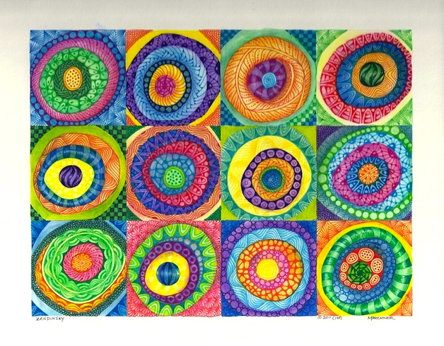
Recently at the Zentangle Inspired Art Yahoo group there was a challenge that inspired me. One of the members wrote: "Every time I see the Concentric Circles in Squares by the artist Kandinsky - I am so drawn to it. In fact I have a shower curtain that has concentric circles in bold colors...  the challenge is to create a piece of art using concentric circles AND incorporating tangles into that piece of art. Use bold colors as Kandinsky did." Well, I've been into circles for a long time, and also enjoy Kandinsky's paintings. Here's the one that inspired the Yahoo challenge:

Vasily Kandinsky's "Color Study: Squares with Concentric Circles" ca. 1913

I've always liked repeated patterns (who'da thunk?). I used a piece of white, 4-ply mat board, a little larger than 8"x10", and measured out the squares.  I drew some round and round circles with water-soluble colored pencils, then carefully 'painted' each ring with water to eliminate the pencil lines. Then out came the pens! After that, shading with colored pencils. Here's my take on Squares with Concentric Circles, which I'm calling Zendinsky. :-)

Tangles: Arches, Betweed, Caviar, Coaster, Daggerly, Finery, Florez, Hibred, Knightsbridge, Lotus Pods, Munchin, Parabola, Pearlz (sort of), Perfs, Sanibelle, Striping, Tipple, Unyun, Wud
This was a lot of fun. I'm thinking of using this idea again, maybe in gray tones? maybe larger? maybe...?

Thursday, May 19, 2011

Jack Wise, Artist

I have long enjoyed the intricate mandalas painted by Jack Wise. In particular I like how he often flows the same pattern through various color changes or shading.

In his early 30s Jack Wise moved from the United States to British Columbia, Canada, to pursue a life as a homesteader. That was in the early 1960s. After a brief hiatus, he returned to his painting with a passion that lasted the rest of his life. Wise was known for his calligraphy based upon Chinese brushwork, and for his colorful mandalas which embody a Buddhist cosmology. 

I originally had one of Jack Wise's mandala paintings on this blog post, but was requested to remove it. I did. Nonetheless, you can see some of his wonderful artwork here. Click on the yellow word "Contemplate", then on the yellow word "mandalas". Be sure to look at the detail images for each painting.

Friday, April 15, 2011

More Mooka-licious-ness-essity

Mooka's got me hooked. But then, so did Ixorus when it was presented a few months ago. In fact any tangle new to me hooks me for a while until I feel I know it well enough to add it to my tangle arsenal. I think I see a lot of possibilities in it and I just don't seem to be able to put them on paper. I had to do more.

The art nouveau botanical look of Mooka kept reminding me of a painting I like. J.E.H. MacDonald was a member  of the Group of Seven, a seminal group of Canadian landscape painters. He painted Tangled Garden in 1916. In the Diva's slide show for challenge #16 Mooka, I saw many creations that resembled tangled gardens.


I've been experimenting. I've wanted to put different ends on the 'frondlets'. I even started a page in one of my Zentangle notebooks for "Possible Frondlet Ends". (We artists are an odd lot, and I include you, dear reader, in the lot!)

I wondered if I could get a more tangled look and tried three stems, putting one up the middle as well as one on each side. I've tried making curvier stems rather than straighter - a lovely effect but I get rather confused as stems profuse. I don't think that's a verb but it rhymes with confuse! Here are starting examples of Mooka with three stems and with curvy stems. I just realized that the 3-stem example only has a middle stem on the first go-round; I'll have to work on that.


In the tile below I used the 'brush' pen for some of the lines. That's what makes them heavy and bold and a little less fluid. Note the "venus fly trap" and "grasping claws" frondlet ends, both unplanned. :-)  Despite those, I rather like this tile.

Tangles: MOOKA and Aura, Fern, Hibred, Pearlz

It seemed every time I did this, all the Mookas began in the middle of the tile and moved out. I decided I'd should probably try to include some major tangles besides Mooka. Here's one:

Tangles: MOOKA and Echoism, Finery, Striping, Poke Leaf frondlets and dots
Mooka and me - we're not done yet!

Wednesday, April 13, 2011

15 (minutes) x 4

Back to basics! When Maria Thomas and Rick Roberts designed Zentangle one of the criteria was that a tile could be completed in 15-20 minutes. No piles of unfinished projects gathering dust in the corner. Instead, a stack of lovely miniature masterpieces. The Diva's challenge this week - "15 Minutes of Fame" - is to do just that: complete a tile in 15 minutes.

Andy Warhol had an art exhibition in Sweden in 1968. In the exhibit catalog he is quoted as saying, "In the future, everyone will be world-famous for 15 minutes." Thus was born one of the iconic statements of our times.

I know I spend longer than 15 minutes on a tile. I've started telling my students 15-30 minutes. This challenge would be interesting!

Once I got rolling it was rather invigorating. I felt like a writer at one of those weekend novel-writing contests, just blasting away, getting something down on the paper, not thinking too much about what was going on the paper.

I intended to do a couple of tiles. In the end, I did four over an hour or so. I noticed that I followed my intuition more and just went with whatever occurred to me as I was drawing. In between tiles, I found myself shaking out my hands and arms like a sprinter before a race!

Here are my four tiles, in order of creation. What amazes me is how different they all are!

There were two whole sections on the left that I didn't even get to. I shaded it instead. And the center of the coil didn't quite get finished. If I hadn't said that you probably wouldn't even have noticed. :-)

I began with a Brush pen in hopes of covering slightly more ground, more quickly!

The dots just happened. I was thinking of something else. The fact that a few sections were better left blank certainly helped with the time constraints!

I do like this one! It reminds me of a Barbara Hepworth sculpture and looks just as interesting upside down. (I have an image of everyone getting up and twisting their necks to see it!) I used a 08 pen for the heavy black areas.

Tuesday, March 15, 2011

Nick Veasey's X-ray photography

Nick Veasey produces wonderful x-ray photographs of insects, fashion, toys, and more. The x-ray technique, resulting in layers of transparency, gives the works a great delicacy, even for an image of a backhoe.

All the images on his site are locked so I can't show you a sample, but go here to have a look. Click on the 'Projects' label in the upper right corner to see the images.


CONTEST UPDATE
Wow, there are some great ideas and connections flowing in! I now have about a dozen favorites, up from five not too long ago.
You have until midnight Sunday wherever you are to send entries to the metaphor contest. You can enter as often as you want and you might win art!

Saturday, March 5, 2011

Brian Dettmer, book surgeon

I've been interested in the idea of altered books for some time and have thought about trying it myself... until I saw this work! (Maybe I'll still give it a shot sometime.)


Webster Two Point Oh, 2008, Altered Book, 11-1/2" x 19" x 11" by Brian Dettmer

"A lot of my work is intuitive when I'm developing it 
and then chance plays a major role before I begin carving 
so I never know where something will end up."

Originally from Chicago, Brian Dettmer currently lives and works in Atlanta, GA. He has been working with old books as his art material for about ten years.

Using knives, tweezers and surgical tools, Dettmer carves one page at a time. Nothing inside the out-of-date encyclopedias, medical journals, illustration books, or dictionaries is relocated or implanted, only removed. He manipulates the pages and spines, folds, bends, rolls, and stacks multiple books to create his book sculptures.

See 15 of his astonishing pieces here. See more art, and read a short interview here. His website is here.

I'm blown away.


Kingdom, 2008, Altered Books, 9-5/8" x 10-3/4" x 9-3/4" by Brian Dettmer

Friday, February 11, 2011

Sand Man, Sand Dancer, Sand Art

Peter Donnelly has three or four hours between tides to produce his artwork. He's based in Christchurch, New Zealand and his canvas is the sand at the beach. He's working down on the beach, of course, and doesn't have an arial perspective of the large images he's making, but he says he's always been able to picture things in his head.


Donnelly's work echoes the philosophy of the Tibetan Buddhist monks who create sand mandalas and demonstrate the impermanence of everything. He knows that it's all temporary and does it anyway. In one video he mentions that he has created 697 works in nine years. You'll see swirls, checkerboards, teardrops, spirals, words, human forms, labyrinths and more. Zentangle enthusiasts will recognize a kindred spirit who also works dark on light, taking the lines and patterns wherever the spirit moves him, albeit on a much larger scale!

Watch a 10 minute video of Peter Donnelly and his work here.
See some still photos and another video, and read a bit more here.

Friday, January 28, 2011

More fun with blind strings

I really enjoyed Laura Harms' challenge to do a zentangle tile having done the string with your eyes shut. For one thing, it sometimes creates wobbly lines to work with. I also find that it usually places the string off-center - and occasionally off the page! That was the part I liked best. It sent me right over the edge! :-)

It reminded me of when the technology of photography arrived on the scene and artists started playing with it. It produced some interesting compositions with off-center subjects. Sometimes the subjects were only partly in the picture. Sometimes the images were even blurry. It gave painters a whole cartload of new things to think about! Gustave Caillebotte, a French painter working in the late 1800's, is one artist who was quite taken by this new way of conceiving the picture plane. Here are two of his paintings.
"The Oarsmen", 1877
"On the Pont de l'Europe" 1876-77, Kimbell Art Foundation, Fort Worth, USA
It looks perfectly ordinary to us now, but 140 years ago it was quite bizarre.

Okay, so coming back off that tangent, here are some of the blind string tiles I've done recently, admittedly much less impressive than Caillebotte's paintings.

with Zedbra and droplets

This tile includes a tangle pattern concocted by myself and Laura Harms, CZT, also in Saskatoon. It's along the left edge and it's called Zedbra.

Laura said about Zedbra: "...it was created by Margaret, but named by me... it's a little inside joke.  Margaret and I are both Canadian and in Canada "Z"s are pronounced zed not zee..."

Click here to see one of Laura's tiles (from her weekly zentangle challenge number 2) using Zedbra including highlights along the middle.

I'll post a how-to page on Zedbra soon (although you can probably figure it out yourself).

 This tile
includes a pattern
I discovered recently on
stART's blog. There are two
bold  stripey edges in this tile,
and two delicate rolling edges.
The delicate tangle is called
Organza Pleated Ruffle
and was designed
by Ruth Howell,
a friend
of stART's.
Ruth's tangle has dots
around  the curved parts,
so perhaps this is a tangleation!?
It works nicely with Lilypads.


Sunday, January 2, 2011

Man decorates basement with $10 worth of Sharpies

Whaaa?!?!?
Charlie Kratzer decorated his sizeable basement with $10 worth of Sharpie pens, and it's wonderful!
"People are amazed that with something as simple and inexpensive as a Sharpie, you can decorate a whole basement," says he, and I am! There are historical and literary personages, famous paintings and cartoon characters. There is a curving staircase and a fireplace. And lots more.
You can watch a 360 degree video of his drawing skills here.

Monday, December 6, 2010

Marvellous micro pencil-tip sculptures

I haven't (yet) used a magnifying glass when creating artwork, although the thought has occured to me on several occasions. Perhaps it's only a matter of time with my love of detail and my middle-aged eyesight. I'm sure if I was doing this kind of thing I'd be into the magnifying glass.


Dalton Ghetti carves tiny sculptures in the tips of lead pencils. Yes. Really, he does. Regular-sized, ordinary pencils.


I had his stubby pencil alphabet as my computer wallpaper for a while. I changed it  because I kept misplacing files amongst the shiny colors.


One of my other favorites is the saw, which uses the lead for the metal part and the wood for the handle part.


See more examples of his very fine motor skills here and here.

Thursday, December 2, 2010

Take Time to Laugh


For an artsy chuckle, wander around the blog That is Priceless - Art's Greatest Masterpieces Made Slightly Funnier. Steve Melcher, who operates the blog, is a two-time Emmy-winning comedy writer. He finds old world paintings and gives them updated and humorous titles.


This lovely little oil on panel by an anonymous artist from the
Flemish School has been re-titled
Liberace’s First Day of Kindergarten


Here is an oil on canvas by the British artist John William Godward that demonstrates the Effect of Alcohol on Model's Willingness to Pose Nude.


This 1424 fresco by the Italian painter Masaccio depicts St. Peter Alerting Lunch Companion that He's Forgotten His Pants

Enjoy!