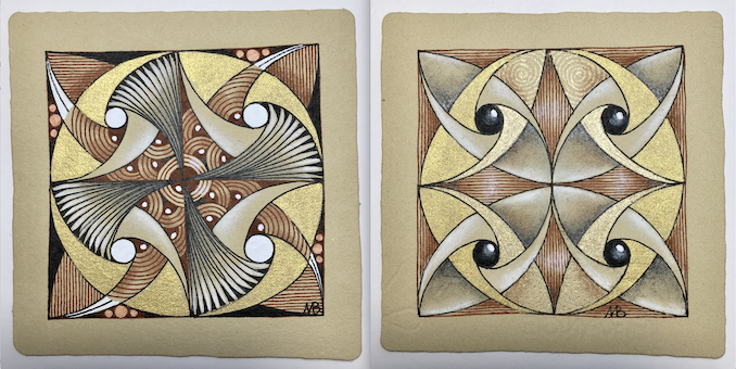
Showing posts with label Renaissance tiles. Show all posts

Wednesday, April 7, 2021

Leaky pen borders

Stop! Don't throw out that leaky pen!
You can use it to make interesting borders...

Below is the first tile I ever did with a leaky pen border.

And here's one with twisted Striping and Knightsbridge.

It's a simple matter of rolling the leaky end around over the edge of the tile. You need to be a little cautious so you don't get ink all over your fingers! Here is my first video (!!!) to show you how I go about it. (I couldn't see the camera, and the sound was on, so you can hear my husband giving me instructions!)


Below are a couple of photos showing the border in process, and what it looked like when finished. This is on eco-dyed paper.

Here is the result of the tile in the video.
Tangles: Crescent Moon, Doodah, Knase,
Knightsbridge, Snail 

"Window on the Woods"
(c)2015 Margaret Bremner
Tangles: Pearlz, Seljuk, Wud

I really like using Seljuk as a border with the leaky pen.
It nicely accommodates some of the blotches and irregularity. 
"The Door's Always Open"
(c)2017 Margaret Bremner
Tangles: Crezn't, Floo, Paradox, Pearlz,
Sanibelle, Seljuk, Tagh

Thursday, January 28, 2021

Color words

I have a long-standing interest in languages and linguistics and in color, so of course I'm curious about how various languages refer to colors. Here is a bit of what I've learned, paired with some more-or-less appropriate artwork!

Primitive languages have only two color words
and they are for black and white,
or - more accurately - dark and light.


If a language has only three words for colors,
they are for black, white, and red.
This is because red is so closely associated
with life and death.


Color terms are added in a fixed order
as a language evolves.
Next to arrive are words for green and yellow,
one or the other, and then the other. 


After yellow and green is blue.


All languages distinguishing six colors have terms
for black, white, red, green, yellow and blue.
I wonder if this is why a basic crayon or paint set contains
 those colors and is missing orange and purple?


As languages develop they next add
a term for brown. 


Brown is followed by orange, pink, purple and gray,
in no particular order.


Finally a term for light blue appears.
Russian makes this distinction with 
sinii (dark blue) and goluboi (light blue).
These are as separate and distinct for Russians
as red and pink are for English speakers.


(No, this isn't my art, but it gets the point across nicely!)

Irish apparently has two words for green. 
Glas denotes the green color of plants and the gray-green of the sea,
while 
uaithne describes the artificial greens of dyes, paints, and such.
Apparently this distinction is made even if the hues are identical.
It seems it's not so much about the color itself,
but about how it came to be.


And there you have a brief history of words for colors.

Thursday, January 14, 2021

2020's Twelve Days of Zentangle

Zentangle's Project Pack 12. The annual Twelve Days of Zentangle. This year, Zentangle Renaissance. It's taken me quite a while to find the time to do this project but all in good time. Aaand... here we go!

DAY ONE - Bronx Spear, an interesting tangleation of Bronx Cheer. My little pot of gold gouache was hard as a rock, so while waiting for it to reconstitute I used gold acrylic paint.

DAY TWO - In my book you can't go wrong with Crazy Huggins, and I love the idea of double DooDah in the horizontal ones.

DAY THREE - This took a wrong turn right from the start when I did the four fragments all the same rather than turning them as I went. I kept going, wondering what delight would appear out of the 'oops', and it's one of my favorites! That's the first tile below. The second tile is my second try, and how it was "supposed" to go; I really like this, too, and hope to experiment with it more.

DAY FOUR - The idea was to do three of these, with a gold border along the entire bottom, then bend them at the center, glue the sides together, and have a lovely tiny conifer tree shape. My gold ended up in a corner, and I only did the one.

DAY FIVE - Aura'd Fife, "tethered" Auras, a coffered border, and more. I realized that Fife with the inner Auras is a lot like Double Double without the initial square grid. I like the idea of white chalk rings but mine didn't work well.

DAY SIX - We used four bijou tiles, four overlapping hearts and the tangle Scena.

I like doing (almost) the same thing on four bijou tiles 
and then seeing the various ways they can be placed.

DAY SEVEN - We began with a light gold wash over the entire paper (gorgeous!), then added Paradox, Pearlz, and Flux. I also used Paisley Boa immediately beside Pearlz.

DAY EIGHT - We started with a pre-strung zendala tile, and then completely ignored the string to create the border! I wanted to preserve a little more of the pre-strung design so I left the star points visible. My gouache still wasn't smoooooth so I used a lot of different metallics in the center: gold acrylic paint, copper acrylic paint, gold gel pen, copper gel pen, and clear star gel pen.


DAY NINE - On a phi tile, a Purk/Festune mashup, Pearlz, Stiritup, and more. I really like the phi tiles.

DAY TEN - On a 3Z tile, some paisley-like, moon pie-ish shapes. and a gold border. My gold gouache is somewhat reconstituted so I used it, but it's still very grainy.

DAY ELEVEN - The tangle Drawings on a zendala tile. I couldn't get the shadow as dark as I wanted even with a 6B pencil so I added tiny wavy lines in black.

DAY TWELVE - On a square tile, we began with Mi2. Then we added Auras,"capes" :), and "therefores" (AKA Tridots, or cinta marta?)

Many thanks again to those at Zentangle HQ for another fun project pack!

Thursday, December 17, 2020

Have you noticed hubcaps?

I was out walking the other day and noticed an interesting hubcap. Then I noticed other hubcaps. What wonderful inspiration for mandala designs! Simply plug "hubcap photos" into an image search engine and you'll find lots of inspiration! Here are five, along with the hubcap that inspired them.

Tangles: Black Pearlz, Doodah, Fife, Hibred,
Prestwood, Skyesil, Zewm


Tangles: Dewd, Icantoo, Mazorito, Snail

Tangles: Crescent Moon, Fohbraid, Gewgle,
Tipple, Zewm


Tangles: Apacore, Cubine, and elements of
Moonwaves and Tripoli, and more.


Tangles: Black Pearlz, Prestwood, Slowpoke, and more

Wednesday, September 2, 2020

Quotations and art - Ways of seeing


Today, here are a few more favorite quotations, paired with art.

"There is, at the surface, infinite variety of things; 
at the center there is simplicity and unity of cause."
Ralph Waldo Emerson said this, and these are my three favorite, very simple tiles. Less can be more. I particularly appreciated this quotation when I was focusing on mandala imagery, considering the center and the perimeter.

"The ability to create beauty is God's greatest gift to man. 
And the appreciation of beauty - whether man-made 
or natural - is not only a joy but an active call 
to something much greater than oneself."
The quotation is from Painton Cowen in the book Rose Windows which I greatly enjoyed years ago, again, when I was researching and creating mandalas. This ATC I made has found a new home. The hummingbird is a transfer print; the rest is pen and ink on eco-dyed paper.

"See the extraordinary in the ordinary."
I'm sure I heard this somewhere, but I'll take credit for it. 😉 I'd brought this pine cone home because something about it appealed to me. Later I was looking at it and it struck me that there was a pattern of triangles at the ends so I did this drawing focusing on those triangles. 

"It is time for parents to teach young people early on that 
in diversity there is beauty and there is strength."
Thank you, Maya Angelou. It's time to stop seeing black and white, men and women, old and young, as opposites and in conflict, and instead know that they are complementary. Let's grow up.
These two pieces were created by cutting tiles in half - in an irregular line - and sticking the opposite halves together. There is another black-and-white and another black-and-tan tile somewhere.

"If thou wishest a discerning eye and seekest for a hearing ear,
 set thou aside that which thou hast heard 
from fathers and ancestors, for such things are imitation."
We mustn't believe everything we hear. We have a rational brain; let's think for ourselves.
These "pages" are drawn on eco-dyed paper. Looking for hints of subject matter in the dye markings, I just couldn't stop seeing eyes at the top right of the one page, so even though I almost never depict people I went with the flow and discovered this man. The quotation seemed to go well with it.
From The Tablets of 'Abdu'l-Baha

Want more? See A few favorite quotations... (and art) here.

Thursday, July 2, 2020

Teabag stains

Recently I noticed a hibiscus teabag in the kitchen sink and was struck with the beautiful, rich red of the water seeping from it. I decided to try staining some paper and saved a few more teabags. It's curious how the pink/purple shows up so well on gray paper, but not at all on white or tan. Still, the grays are lovely.
Here's the first tile I did with the first small batch of stained tiles. I've used some of the teabags three or four times and they're still staining very nicely.
Tangles: Ayame, Finery, Mooka elements
I added some white vinegar to the water in which I dipped the teabags, but I'm still rather concerned about fading. Most of these stained items will likely become ATCs or bookmarks - things which will generally not be exposed to light. The ATC below is at the lower left in the selection of stains above.
Three zentangle-tile-sized pieces.
Henrike Bratz, a CZT in north Germany near Denmark, contacted me on Instagram about the colors not showing on some papers. She advised me to put a dab of lemon juice on my finger and touch that to the dried stain. It worked beautifully, as you can see below. Apparently the acidity of the lemon juice is what's needed.
Here are two tiles done for Hanny Nura's Full Moon Mosaic on Instagram. The first uses the tile in the lower right above.

Finally, every time I looked at this next tile I saw a little crab. So that's what it is.