Showing posts with label color. Show all posts

Sunday, August 22, 2021

Pre-strung fun

Tangles: Bunzo, Ennies, Moon Pies, Pearlz

It's a hashtag, too! #prestrungfun. Have a look on Instagram and Zentangle's Mosaic app.

"Pre-strung" means that there are pale, gray lines provided on the paper so you have a string to start with. Zentangle(R) offers many tiles like this.

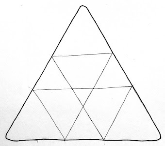
This project ("challenge"), the brainchild of three CZTs, is based on one of Zentangle's pre-strung zendala tiles, pictured below. I admit, this is not one of my favorite pre-strung strings, but I had two white ones so I thought I'd do two. Why not?


Sometimes an idea grabs my collar and whisks me away on a wild ride of creativity. Usually when I don't expect it. This was one of those times. I found myself working on one tile while ideas for another one flew at me.

Come along for the wild ride with me...

The first two I did were on white tiles. One is at the top of this post. Here's the other.
I tried using the tangle Kahla as another string, wondering what would happen if I tried to overlay two strings.

Tangles: Kahla (the overlaid string), Moon Pies,
Pearlz, Pepperish, Romanancy, Striping, Tipple, Wud

I wanted to do more! I hunted, and discovered I had some tan and black tiles with this pre-strung string. The first began with smears of copper ink from a leaky pen; the second was going to be the 'mosaic' border and something else in the middle, but you know how things go!

Tangles: Ennies, Pepperish, Printemps, Snail

Tangles: Hmmm... well, it was going to be Seljuk
but it ended up being gradations of gray Moonlight pens.

It worked well with Kahla, so on this tan tile I wanted to try using Within as an overlaid string.

Tangles: Within (the overlaid string)
Apacore, Paizel, Pearlz, Pepperish, Seljuk

Colorful ribbons wanted to play on a white tile.

Tangles: Aquafleur and Tipple

And finally, on a tan tile, sort of paisleys. And more. A lot more.

Tangles: Crescent Moon, Ennies, Purk,
Soul Star, Thumbprintz, Tipple, Within 

I understand there will be another Pre-Strung Fun event. Hope you can join in!

Wednesday, February 24, 2021

Forgotten Places

Last November I participated in an online workshop given by Deb Prewitt that she calls Forgotten Places. I find random markings to be wonderful inspiration and have been looking to try other methods to create artwork 'starts'.

We began by consciously creating ugly things using watercolor, fluid acrylic, drips, spatters, and more. The uglier the better said Deb! Here's what I ended up with.


The first piece I finished - immediately following the class - is the one below. I was recalling the New York city subways when we were there for our youngest daughter's graduation from NYU.
Oddly, the photo I recalled that inspired this is completely different!


I was rather taken with Cherryl Moote's new tangle Morrisseau, so I did that on the next ugly start. 


The ugly start below called to mind mountains in the upper left, and windblown pink flowers in the foreground, so I developed that idea.

How "Windy Valley" began
"Windy Valley" completed


Crusade is a square grid tangle that I quite like, so I developed it on the next ugly start that already had a few gridlines on it.

The ugly beginning.
(In this photo the paper is really crooked!)

Art finished!

More to come, for sure!

Wednesday, February 10, 2021

Project Pack 12 follow-up

My Project Pack #12 all-in-one recap tile.

As always with Zentangle's project packs there are one or two of the projects that really strike my fancy and I want to explore more. This time it was Day 3's Well... with a twist... and extra lines.

I did one very regular and formal, on an eco-dyed tile (above). I think it looks like some kind of medallion.

Then I did a wonky, irregular one on a tile stained with a hibiscus teabag. I think I like it better. 😊

I knew it would be interesting in a group and I'd like to explore this possibility more.

This went a little haywire in the center.

Quite some time ago Chris Titus sent me a few tiles she had eco-dyed. I'd added a bit of gold wash to this one, but it stayed around until now. It was just so lovely and I couldn't decide what to do with it. I had thought I'd round all the corners and do Well in every square, but I didn't want to lose all the lovely texture of the eco-dyeing. I think it has a stained glass window look to it.

1) Chris's tile with a few lines. 2) My finished tile. 3) At a slant trying to show the gold better.

A final tile, with some texture from a glue spiral and gold wash.

Thursday, January 28, 2021

Color words

I have a long-standing interest in languages and linguistics and in color, so of course I'm curious about how various languages refer to colors. Here is a bit of what I've learned, paired with some more-or-less appropriate artwork!

Primitive languages have only two color words
and they are for black and white,
or - more accurately - dark and light.


If a language has only three words for colors,
they are for black, white, and red.
This is because red is so closely associated
with life and death.


Color terms are added in a fixed order
as a language evolves.
Next to arrive are words for green and yellow,
one or the other, and then the other. 


After yellow and green is blue.


All languages distinguishing six colors have terms
for black, white, red, green, yellow and blue.
I wonder if this is why a basic crayon or paint set contains
 those colors and is missing orange and purple?


As languages develop they next add
a term for brown. 


Brown is followed by orange, pink, purple and gray,
in no particular order.


Finally a term for light blue appears.
Russian makes this distinction with 
sinii (dark blue) and goluboi (light blue).
These are as separate and distinct for Russians
as red and pink are for English speakers.


(No, this isn't my art, but it gets the point across nicely!)

Irish apparently has two words for green. 
Glas denotes the green color of plants and the gray-green of the sea,
while 
uaithne describes the artificial greens of dyes, paints, and such.
Apparently this distinction is made even if the hues are identical.
It seems it's not so much about the color itself,
but about how it came to be.


And there you have a brief history of words for colors.

Thursday, October 29, 2020

Phi again. PP11 follow-up

A bijou tile with Apacore centered 
at one of the four phi intersections.

Revisiting the golden mean through Project Pack 11 was such fun I wanted to do more!

The pack contains a "markus operandus" for locating the phi proportions on Zentangle tiles. Markus Operandus II can be downloaded here, for free, at the bottom of the page. I've added marks to mine so I don't have to rotate my paper in order to indicate all the phi lines. I may have it laminated. It looks like this.

It can be used not only with the new Phi tiles, but also with the classic square (also apprentice and bijou) tiles, as well as the triangular 3Z tiles. I wanted to give them a whirl. 

The proportions work on a square just as well as a rectangle. I'd done this years ago when my focus was mandalas. With the mandalas I used all four phi lines to create the working space:

Here's a mixed media painting from that time using these phi ratios.

Pro Fanis  •  ©1998
30" (76 cms) square; acrylic and collage

I've been fascinated with sacred geometry and the golden mean for many years. Delighted to revisit it in this project pack, I created a number of square tiles. 

Using the same four lines as above I did a classic-size tile. You can see Hollyhock in the corners, Icantoo in the rectangles, and the center connects it all.

Tangles: Hollyhock, Icantoo, and hints of
Crescent Moon, Pearlz, and Sanibel

I had a gray tile with a mauve wash. It struck me that somewhere near the 'center' of the flower shape might be a phi intersection. Here is the finished tile, with backwards steps to the mauve wash.

Tangles: Aquafleur, Pearlz, Pokeleaf

This is an eco-dyed tile that I subdivided into various phi-measured sections. I used Moonlight pens and gold ink as well as brown and sepia micron pens.

But triangles? The kit says it works with triangles, too. I don't see why not, but I'd never thought to try it before. On a rectangular shape, there are four phi intersections (shown above). I discovered that with a triangle, there are three.

The black and white 3Z tile below has the tangle Ayame, but instead of beginning it at the center I began at one of the intersections. On the tan tile, I used the six notches at the perimeter as places to begin the droplet shapes.

I'm grateful to Zentangle for reintroducing me to divine proportion. I plan to do a lot more with these measurements.

Thursday, August 6, 2020

Crescent Moon, and then some - the 'moons'

Crescent Moon is one of my go-to tangles. I can hardly believe I haven't explored it in a blog post yet!

We often call the partial 'moons' in this tangle ladybug shapes. So why not actual ladybug drawings? You could even use red ink. :D

One of my favorite things to do is to add a small highlight to the 'moon'. Here's a tile with highlights, and also the original Crescent Moon with the 'moons' all black.
Tangles: Beadlines, Crescent Moon, Pearlz, Tipple

The 'moons' don't have to be arcs. Try different shapes. Here's one with hearts.
Tangles: Crescent Moon, Ixorus, Lotus Pods,
Paradox, Perfs, Tipple 

Crescent Moon can be layered, instead of a single row, and it doesn't have to go all the way around the section. Try partial Crescent Moon and use it not on every side. Here's a tile showing both those ideas. (You can probably guess that the string here is a blind contour drawing of a bowl and spoon!)
Tangles: Crescent Moon, Irradial, Wunderwall

I learned that Mars has two moons. That inspired this Mars' moons version - two moons nestled together. We won't even go near Jupiter's 67 moons.

The 'moons' don't have to be uniform in size. Try starting tiny and gradually get larger, and maybe back to small again.


Quite a different look is obtained if you leave the 'moons' white. I loved Julie Willand's crazy Crescent Moon from the Project Pack #10 video, Day 5. Here's Julie's example from the video, and mine from my booklet. She left the 'moons' white, so I did the same.

Go large! Draw very large 'moons' and fill them with something other than black. In the tile at the top of this post I've filled two 'moons' with floral-like things. Here's one with three leaf/petal shapes, each with a different fill in the 'moons'.
Tangles: Black Pearlz, Hollibaugh, Hollis, Mooka

Sometimes I like to continue the 'moons' into the adjacent section, creating orbs, but leave the new half white. I find Tipple an ideal tangle for that second section. See the top of this post, as well as the third image, for examples.

Here's a tile with a several things going on. There are white 'moons', 'moons' filled with spirals and with Tipple, a partial Crescent Moon, a three-scallops shaped 'moon', and more.

What other ideas can you think of?
This has been all about the 'bugs'.
Of course, you can also vary the lines and the centers. 
But that will have to wait until another post.