Here's a very simple example, Munchin over parts of Munchin. I've done it in the four corners here, but you could do this along one edge to increase the shading. It could also create a little variation if you end up with too many of Munchin's corners' gathered lines coming together.
I find that tangle patterns composed mainly of lines work best, although some small black areas are fine, and often a nice highlight.
This example is over-the-top, but it shows some ideas. Clockwise from the top: Dust Bunny over Dansk, Tri-dots over Printemps, Cheesecloth over Circfleur (center), and Tipple over Gneiss. For the sake of example, in this case I did the overlaid tangle using a 05 nib and the base tangle in 01.
Here's a piece that I hoped would look like a small creek or stream. I started with Tipple in ovals for the stones, then decided Roxi would be better for some of the larger ones. Then, a gray wash, and Tidings in white over top of the 'pebbles'. It doesn't have the effect I wanted; the water looks as if it's above the plants (I'll try again), but I learned some and it's a good example of overlaid tangles! :)
I've used this technique to lighten, or occasionally darken, an area in a piece of zentangle inspired art, usually in color. I seem often to use Printemps. It's simple lines, no large solid ink areas, but the lines are curved so the pattern isn't immediately obvious. Below is an example on a Renaissance (tan) tile of white Printemps over light blue Printemps.
Here's another example of Printemps over Printemps, this time using purple ink over blue and pink inks. The purple Printemps adds a little shading at the edge and in the blue spiral on the right.
In my experience, if you want the lower pattern to be recognized (sometimes it might not matter) the top pattern should have less to it than the pattern underneath. Here I used white Tri-dots - a very simple tangle - over pink Printemps, as I wanted Printemps to be recognizable.
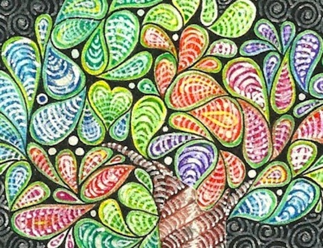
I had done a tree on a tile and quite liked it, but it was too subdued (read: dark), even with some of the brighter colors I'd used. I added white ink, in simple lines, over each of the droplet shapes. In some cases it really disguises what was there originally, but that's alright. The color is still there, and it's much brighter. I did the same thing on the bands of the trunk. Not really a tangle over a tangle, but the same idea.
Finally, here's a piece where the sky is Printemps in medium blue, overlaid with Tidings in dark blue. I used little circles instead of ovals in Tidings and filled them with gold ink. Then I used Tidings again in the foreground to give the same texture as the sky, helping keep the buildings distinct.
 |
| Tangles: Flukes, Groovy, N'zeppl, Printemps, Romanancy, Tidings |
Other possibilities could be: Florz, Tipple, Munchin, Cheesecloth, Groovy, N'zeppl, Tips, Zewm, Hibred, Indy-rella, Yincut... I'm sure you'll think of others!
With different colors it's easy enough to keep the two tangles separate as you're drawing. With black and white you might want to try two pen sizes, or change the scale between the tangles, or use tangles that are different in nature such as Florz and Sand Swirl.
Have fun!


Gosh..what interesting techniques here! I will have to come back and look more closely when I have more time, but Gee..thanks for sharing.
ReplyDeleteJudy
Thanks so much Margaret for sharing this tutorial -- it's informative and wonderful.
ReplyDeleteThank you! This is a very interesting collection of techniques.
ReplyDeleteI'm never good at this...combining tangles...very cool!!! Not really that difficult...I just make it difficult!
ReplyDeleteI love them. I think I'll try that when I'll have more practice. Thanks for sharing, Johanne Lacombe
ReplyDeleteVery inspiring! I will have to try this.
ReplyDeleteI am getting soooo excited! More ideas! Great and thank you so much for sharing!
ReplyDeleteOHMGosh Margaret. What a great tutorial. I know I've noticed some this in your work before but I had not really figured out what you were doing. Walking through this process and even discussing some of the failures (or less than desirable) outcomes is very helpful. I am going to save this post so that I remember to try some of these. Thank you for sharing!
ReplyDeleteThank you for this valuable tutorial. Great information.
ReplyDeleteThank you Margaret for this very informative technique. I will enjoy trying this in the coming days.
ReplyDeleteFinally got a quiet moment to digest post. Very interesting. Beautiful! Thanks for sharing!
ReplyDeleteWhat a different way to use Zentangle. I like the way you use the colors and the white pen to go over the tangles. Thanks for sharing. Stella (CZT12)
ReplyDeleteWow, that is pretty amazing...
ReplyDeleteChristen | http://christenlouise.blogspot.com
Thank you so much for sharing. I'm looking forward to trying this. Happy New Year.
ReplyDeleteLiked this blog entry alot. I posted something related on Square One on Nov 13, 2014 that I call Double Paradox. It was a first attempt but I think it captures the spirit of what you're talking about here. Feel free to share. Doc
ReplyDelete