Showing posts with label My artwork. Show all posts

Wednesday, September 8, 2021

How "Ancient Spirals" came to be

"Ancient Spirals" was created on paper I had eco-dyed some time ago. (Click on "eco-dyeing" in my subjects list on the right to see more about this technique.) It is also inspired by a compositional method I learned during a class from Lynn Mead through TangleU.

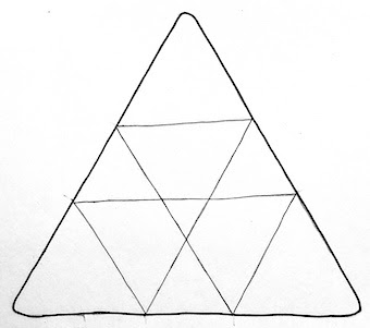
It began with a sheet of paper I'd eco-dyed a while ago.
In pencil, I divided it into 2" squares, leaving a thin border.
Using the eco-dyed marks as guides, I added some arcs to create partial circles.

I had noticed spirals in some places and decided to pursue that imagery.
In pencil I indicated the spirals and some shells and leaves, then
 added a bit of color with Inktense and Graphitint water-soluable pencils.


I began adding details with fine-nib pens: a leaf, a few spirals.
A whole quarter finished.
What are those scallops at the bottom? Feathers? Leaves?


More Inktense. More Graphitint. More tangles.
More leaves. More spirals. More details.
Blue seems to be running diagonally.


Almost finished.
Some of the eco-dye patterning is so beautiful
I want to leave it without any additions.
Colored pencil for final shading.


Aaand... done!  Albeit a bit fuzzy in this photo.


Here's a short video of the progression:

Wednesday, July 28, 2021

Visual Haiku

A while ago I took an online class called Visual Haiku with Serena Barton (through TangleU). Serena uses traditional haiku poetry as inspiration for her non-subjective artwork and she took us through her process.

I was looking forward to bringing in a lot of mixed media elements and trying some techniques I don't often use.

Here is my completed piece, which looks nothing like Serena's work, and was not inspired by a particular haiku! 🙄

ALMOST CLOSE ENOUGH TO TOUCH
8" square • acrylic mixed media

The moon is a blob of dried paint that I'd peeled from the lid of a paint jar and saved. Why? Apparently for this piece! It rises off the surface a centimeter or so. I had fun smearing paint with a palette knife, spattering gold stars with a toothbrush, and collaging bits of my own old artwork onto the hills. I used stencils to create some patterns, then mostly covered them. What do you think?

Wednesday, June 2, 2021

ACSS member spotlight: Me!

For a little over a year I've been participating in the Art Career Success System with Alyson Stanfield. Recently I was the featured artist! I'm reproducing it here as I can't seem to post a link.

*********   *********   *********   *********   *********   *********   *********   *********   *********   *********

Member Spotlight: Margaret Bremner

What has your attention in the studio these days? 

For several years I’ve been making eco-dyed paper, then seeing what I can find in the markings and drawing on it. I’ve tired of the ubiquitous browns and am adding more color to these. But I’m excited now to be trying other ways of creating random markings for art ‘starts’ and being messier with paint and ink and water!

What is your word for the year and why? 

I’ve tried the “word for the year” thing a few times and forget all about it by March. Currently I have the phrase “for now”. At one point I hated it because everything seemed to be something we were accepting for now, and nothing was being resolved. (We’ll keep it for now. Leave it there for now. We’ll stay here for now. It will do for now.) Then I had an epiphany: Everything is ‘for now’. Nothing stays the same. It reminds me of the impermanence of all things, much like “This, too, shall pass”.

A STORM ON THE MOUNTAIN

Our theme this month is taking charge. When you are feeling overwhelmed or out of sync, what do you do to feel like you're in charge again?

Aaah, my buddy Overwhelm. I don’t know if it’s my age, or because I’ve never been a high energy person, or what, but I often feel that my plate is heaped way too high. Usually, I try to get a firm grip on myself and do just one small thing. One thing. A small thing. So I’ve done something. Then I can do another thing. I’m also learning to say “No” more, and trying to consciously determine whether something is in line with my vision and values.


What lesson from ACSS classes sticks with you? 

I particularly remember working on my artist's statement. I'd written one years ago, and revamped it from time to time. But it really didn't fit anymore and I welcomed the opportunity to write a completely new one. I shared on ACSS, rewrote, shared again, received many helpful comments, and rewrote again. In the end, the whole thing changed significantly from mach 4 to mach 5, and I finally got something I was quite happy with by the sixth writing. It's a lot of work but so worth it!

Tuesday, May 18, 2021

A new header banner!

You probably noticed that the blog looks a little different today!

I've been feeling the need for a new design and a new banner for some time. When I began this blog in October 2010 - five months after I became a CZT - I thought it would be about  a variety of art topics including Zentangle. It quickly became almost entirely about Zentangle and this was reflected in the original masthead, below. 

Zentangle instantly became, and still is, a major part of my artwork, but I'm exploring lots of other avenues, and I want the blog header to reflect that.

Recently I chose fonts and colors to use in all my materials across platforms and updated the blog's fonts and colors a few months ago. Some of those are the turquoises and orange in the new banner. (There's still some fine-tuning required in terms of a font on the blog.)

I started to design a new banner, but wasn't happy with where it was going. My first effort, below, went nowhere. (Well, I think it became ATCs or bookmarks!)

I realized that I also wanted to downplay the "enthusiastic artist" part of it, although I'm definitely still enthusiastic! I liked the photo of a work in progress and the supplies I was using. It struck me that I could show something like that in the header's image, with more artwork, and add my name as the major element.

TA-DA!!!

The blog will still be found at enthusiasticartist.blogspot.com for the foreseeable future.

Tuesday, May 4, 2021

Five more Book pages

My Book only has perhaps a dozen pages left in it. I haven't been in a hurry to fill it, wanting it to add something new only when I felt inspired. These are the most recent additions.

I was rather taken with two tangles, Salt (the hexagons) from Franciose Lip and Amazing Spider (in the background) from Hennie Brouwer. 


Two of the recent project packs from Zentangle had flower-like results, which I enjoyed reproducing in my Book.


I was charmed by Cherryl Moote's tangle Morrisseau. Some of the elements here are collaged, some are drawn on the page.

I've occasionally worked with found text, so I did that on one page. I tore two pages from the same book and glued them into my larger book, then hunted and tangled.


I've been loving the stains left by my husband's hibiscus tea bags: pinks, purples, blues, grays, browns, ochres... Unfortunately, the paper in this book is not as friendly towards them as is the Tiepolo paper of the Zentangle tiles. This page ended up with only grays, and rather wrinkly. I also tried using some stencils with the teabags.


*********

For previous Book pages, check these posts:

  1. How it began
  2. Next steps
  3. Inserting an eco-dyed paper
  4. Back cover, an alphabet, gems and paisley
  5. Hexagons
  6. Celtic-style tangles, and W2
  7. Frontispiece and photos of my grandmother
  8. Space junk
  9. A sunflower, and the flower of life
  10. Knightsbridge and magic squares
  11. More space junk
  12. For now - A phrase I hated, now dear to my heart
  13. Mongolian roofs
  14. Cubine and Fassett
  15. Nautilus
  16. Notanical - combining Notan and botanical imagery
  17. An 'oops' page
  18. Inspired by Project Pack 7
  19. Four more pages: twisted striping, and borders
  20. Three more pages: leaves, tea, and spirals
  21. A month of joy
  22. A few more pages in my marvelous book: a dragon, neurographic drawing, and BrixBox/Cantire

Wednesday, April 7, 2021

Leaky pen borders

Stop! Don't throw out that leaky pen!
You can use it to make interesting borders...

Below is the first tile I ever did with a leaky pen border.

And here's one with twisted Striping and Knightsbridge.

It's a simple matter of rolling the leaky end around over the edge of the tile. You need to be a little cautious so you don't get ink all over your fingers! Here is my first video (!!!) to show you how I go about it. (I couldn't see the camera, and the sound was on, so you can hear my husband giving me instructions!)


Below are a couple of photos showing the border in process, and what it looked like when finished. This is on eco-dyed paper.

Here is the result of the tile in the video.
Tangles: Crescent Moon, Doodah, Knase,
Knightsbridge, Snail 

"Window on the Woods"
(c)2015 Margaret Bremner
Tangles: Pearlz, Seljuk, Wud

I really like using Seljuk as a border with the leaky pen.
It nicely accommodates some of the blotches and irregularity. 
"The Door's Always Open"
(c)2017 Margaret Bremner
Tangles: Crezn't, Floo, Paradox, Pearlz,
Sanibelle, Seljuk, Tagh

Wednesday, March 24, 2021

Tinted graphite - February's SketchBox

I've subscribed to SketchBox art supplies for six months and the February box was about graphite and tinted graphite. It's water-soluable, so it can look a bit like watercolor.

The supplies that came in February's box.

I started with some random, pale gray lines, thinking I might do a set of houses as I've done often in the past. However, three mountains appeared instead. This is 4"x6".

How it began

How it ended

I have a set of French curves and used some "as is" to create curvy sections, colored with the tinted graphite, added water, then tangled on top. This is also 4"x6".

Tangles: Black Pearlz, KrliQs, Peppering, Wunderwall

I used tinted graphite, micron pens, and colored pencil to create the piece below on beige tinted paper, again 6"x4.

Tangles: Icantoo, Paizel, Pearlz

I like the tinted graphite better than I expected. I like using water with it, and it offers muted colors, which sometimes is what you want.

Thursday, October 29, 2020

Phi again. PP11 follow-up

A bijou tile with Apacore centered 
at one of the four phi intersections.

Revisiting the golden mean through Project Pack 11 was such fun I wanted to do more!

The pack contains a "markus operandus" for locating the phi proportions on Zentangle tiles. Markus Operandus II can be downloaded here, for free, at the bottom of the page. I've added marks to mine so I don't have to rotate my paper in order to indicate all the phi lines. I may have it laminated. It looks like this.

It can be used not only with the new Phi tiles, but also with the classic square (also apprentice and bijou) tiles, as well as the triangular 3Z tiles. I wanted to give them a whirl. 

The proportions work on a square just as well as a rectangle. I'd done this years ago when my focus was mandalas. With the mandalas I used all four phi lines to create the working space:

Here's a mixed media painting from that time using these phi ratios.

Pro Fanis  •  ©1998
30" (76 cms) square; acrylic and collage

I've been fascinated with sacred geometry and the golden mean for many years. Delighted to revisit it in this project pack, I created a number of square tiles. 

Using the same four lines as above I did a classic-size tile. You can see Hollyhock in the corners, Icantoo in the rectangles, and the center connects it all.

Tangles: Hollyhock, Icantoo, and hints of
Crescent Moon, Pearlz, and Sanibel

I had a gray tile with a mauve wash. It struck me that somewhere near the 'center' of the flower shape might be a phi intersection. Here is the finished tile, with backwards steps to the mauve wash.

Tangles: Aquafleur, Pearlz, Pokeleaf

This is an eco-dyed tile that I subdivided into various phi-measured sections. I used Moonlight pens and gold ink as well as brown and sepia micron pens.

But triangles? The kit says it works with triangles, too. I don't see why not, but I'd never thought to try it before. On a rectangular shape, there are four phi intersections (shown above). I discovered that with a triangle, there are three.

The black and white 3Z tile below has the tangle Ayame, but instead of beginning it at the center I began at one of the intersections. On the tan tile, I used the six notches at the perimeter as places to begin the droplet shapes.

I'm grateful to Zentangle for reintroducing me to divine proportion. I plan to do a lot more with these measurements.

Thursday, July 2, 2020

Teabag stains

Recently I noticed a hibiscus teabag in the kitchen sink and was struck with the beautiful, rich red of the water seeping from it. I decided to try staining some paper and saved a few more teabags. It's curious how the pink/purple shows up so well on gray paper, but not at all on white or tan. Still, the grays are lovely.
Here's the first tile I did with the first small batch of stained tiles. I've used some of the teabags three or four times and they're still staining very nicely.
Tangles: Ayame, Finery, Mooka elements
I added some white vinegar to the water in which I dipped the teabags, but I'm still rather concerned about fading. Most of these stained items will likely become ATCs or bookmarks - things which will generally not be exposed to light. The ATC below is at the lower left in the selection of stains above.
Three zentangle-tile-sized pieces.
Henrike Bratz, a CZT in north Germany near Denmark, contacted me on Instagram about the colors not showing on some papers. She advised me to put a dab of lemon juice on my finger and touch that to the dried stain. It worked beautifully, as you can see below. Apparently the acidity of the lemon juice is what's needed.
Here are two tiles done for Hanny Nura's Full Moon Mosaic on Instagram. The first uses the tile in the lower right above.

Finally, every time I looked at this next tile I saw a little crab. So that's what it is.

Thursday, March 19, 2020

"Ye Are The Stars" process

I recently purchased a stencil called Alhambra (from Marieke on Etsy) and used it to create "Ye Are the Stars" on an eco-dyed Opus tile.

Here is the paper as it came out of the dye-bath. I intended to retain more of these colors, but that's not what developed.
I didn't want simply a pattern with designs, so I searched to see if there was a 'star moth' or 'star butterfly' I could incorporate. Lo and behold! There's a Pink Star Moth, native to the southeastern coast of North America! I found pictures and did one in colored pencil.
Fairly far into the drawing I decided there were just too many patterns going on; I liked them, but they weren't contributing to the look I wanted. Here are two details:
I didn't like the Ragz on the left or the five different corner sections on the right.
I had to change them. With high quality art paper (like the Tiepolo of Zentangle and Opus tiles), if I'm very careful I can peel off a top layer of the paper and begin almost fresh. I got out my scalpel, tweezers, and bone folder and got back to drawing.
(See further down for "How to peel paper".)

I re-tangled all those sections, opting for Tidings all over, and am much happier with the corners now. There is gold ink in each of the nine 8-pointed stars.


Here is the finished artwork.


HOW TO PEEL PAPER
First, I lightly cut around the edge of the section I want to remove - more like scoring than cutting. I absolutely don't cut all the way through! Then, I loosen a corner or two with the knife point...
... and use tweezers to peel off the top layer. It never goes neatly! I always have to pick off more edges and peel more. But eventually I get it all off, leaving a rather fuzzy section of paper.
Then I use the bone folder to really smooth it down. A thumbnail works well, too.

THE TITLE
"Ye are the stars" comes from this quotation from the Baha'i sacred writings:
"O friends! Be not careless of the virtues with which ye have been endowed, neither be neglectful of your high destiny. Suffer not your labors to be wasted through the vain imaginations which certain hearts have devised. Ye are the stars of the heaven of understanding, the breeze that stirreth at the break of day, the soft-flowing waters upon which must depend the very life of all men, the letters inscribed upon His sacred scroll."