Showing posts with label art techniques. Show all posts

Wednesday, April 7, 2021

Leaky pen borders

Stop! Don't throw out that leaky pen!
You can use it to make interesting borders...

Below is the first tile I ever did with a leaky pen border.

And here's one with twisted Striping and Knightsbridge.

It's a simple matter of rolling the leaky end around over the edge of the tile. You need to be a little cautious so you don't get ink all over your fingers! Here is my first video (!!!) to show you how I go about it. (I couldn't see the camera, and the sound was on, so you can hear my husband giving me instructions!)


Below are a couple of photos showing the border in process, and what it looked like when finished. This is on eco-dyed paper.

Here is the result of the tile in the video.
Tangles: Crescent Moon, Doodah, Knase,
Knightsbridge, Snail 

"Window on the Woods"
(c)2015 Margaret Bremner
Tangles: Pearlz, Seljuk, Wud

I really like using Seljuk as a border with the leaky pen.
It nicely accommodates some of the blotches and irregularity. 
"The Door's Always Open"
(c)2017 Margaret Bremner
Tangles: Crezn't, Floo, Paradox, Pearlz,
Sanibelle, Seljuk, Tagh

Thursday, April 18, 2019

Square grid reticulae, and then some

There are so, so, many, many tangles based on a simple square grid. This is a wonderful way to begin because it gives a basic structure to work within, even beyond the string lines. To change it a bit, there are interesting things you can do to a square grid that give it a different character, and make it less recognizable as a grid.

Idea #1 - CURVY
One possibility is to leave the straight lines behind and do the grid with curvy lines. Here are some examples.
Tangles: Cubine, Eye-Wa, Florz, Juke
Tangles: Beadlines, Jemz, Knightsbridge, Pearlz
Fragments: A3, and the 'Lisbon fragment'

Idea #2 - SHAVED
Shave off alternating sides of the squares, like this:

Here's a tile with four examples. Sometimes it looks like tightly woven bands - like W2 without the black square 'holes'.
I like to fill in the strips so the intersections of the original grid are not obvious. That means black, or something with a black background. Here's an example of a grid with curvy lines, and solid black with Pearlz filling the shaved areas.
You can add detail to the shaved-off slices (as above), or the remains of the square, or even both.

IDEA #3 - IRREGULAR
Another way to add variety and interest to a square grid is to vary the width of the stripes. Alternate a wide stripe with a narrow stripe, gradually change the widths, or be random.
Irregular Beelight, Florz, and something I made up, I think.
Irregular Flukes, Zonked in the corners.
IDEA #4 - OFFSET
There is a grid with offset large and small squares. It definitely takes some concentration to set up, but it's not too difficult and it's fun to work with. I used it in the tail of the peacock here.
Check out BrixBox from Anneke van Dam. Anneke's steps for setting up this grid pattern are well done and rather than reinventing the wheel I'll let you go to her blog to see it, as well as some lovely examples of ways to fill this grid pattern.
Tangles: Cubine, Knightsbridge, Zewm
Have fun!

Tuesday, October 3, 2017

Working on papyrus

A few years ago, at a museum exhibition about Mesopotamia, I purchased a package of actual papyrus pages in the gift shop. This is the first time I've used it. It's layered and stripey but wasn't as difficult to draw on as I had expected, although I used larger nib pens.

The 'two women' image - Queen Kawit and a servant - is from a National Geographic magazine. 
The ink drawing is mine, including the Aura of squares around the image.
The queen's mirror is highly reflective silver paper.
There are several tiny gems in the queen's necklace and on the four papyrus plants on the left.

I processed the magazine image to eliminate the paper but keep the image. This is especially useful if you're concerned about archival quality and are using paper that's not acid-free (basically all magazines). In this particular case, 'archival' is not really an issue because the papyrus itself is not archival, but I wanted the texture of the papyrus and a bit of the tan color to come through the image. Magazine ink is another issue.

In fact, it's less about getting the image off the paper as it is about getting the paper off the image! 

Here's what I do:
  • Leave a good two cms. (1/2" +) of border around the image you want to use.
  • Paint six layers of acrylic matte medium on the image, letting each one dry well. You could use glossy medium instead. 
  • Lightly score the back, where the paper is still accessible, with an X-acto knife and wet it liberally with water. You'll see dark lines appear where the water is soaking into the cuts.
  • Carefully rub off all the paper. This takes a few sessions of scoring and rubbing and lots of re-wetting. If you're done, the back will feel quite smooth.
  • In the end, the paper disappears but the ink is left behind. Then you can trim the image to the edges you want. Note that it will be floppy to handle.
  • Use the same matte or glossy medium to affix the image to your art surface.

Some of the supplies I use, and two other images
I plan to use in future artwork.
I'm still not quite sure what I think of it, but it was fun to do!

Thursday, October 27, 2016

Starting with splats

I bought some Derwent paint pens so I could draw with paint. Instead I've been using them to make washes. I started three tiles with washes: black and gray on white paper, white on black paper, and blue on tan paper. Here are the three tiles with just the ink splats:
For some reason I tackled the black paper first. I drew in both black ink and white ink, and fine tuned with a lot of pencil crayons. I'm rarely happy with my results of white on black work, but I really like this one!

I saw a leaf shape on the white tile so I went with leaves again. I left the trunk branches untangled; it seemed better to keep it simple and let the leaves stand out.

Maybe I was still inspired by two recent DivaCZT challenges, one to use leaves as inspiration, the other to spill something on the tile first.

In any case, I was on a roll. On the tan tile I did more leaves and tangled in brown and various blues and white. I'm calling this one 'Water Leaves Bubbles' (sort of like Eats Shoots and Leaves). :D
Tangles:
'Night Vines' - Tipple, Betweed-ish, and lots of lines
'Aspen Fall' - Finery, Pearlz, Betweed-ish, Tipple (Caviar version)
'Water Leaves Bubbles' - Black Pearlz, Finery, Nipa, Pearlz, 
Tipple (Caviar version)

Thursday, December 18, 2014

Overlaid tangles - a tutorial

Have you ever tried laying one tangle over another? I don't do it often, but it can have a wonderful effect, adding a textural element.

Here's a very simple example, Munchin over parts of Munchin. I've done it in the four corners here, but you could do this along one edge to increase the shading. It could also create a little variation if you end up with too many of Munchin's corners' gathered lines coming together.
I find that tangle patterns composed mainly of lines work best, although some small black areas are fine, and often a nice highlight.

This example is over-the-top, but it shows some ideas. Clockwise from the top: Dust Bunny over Dansk, Tri-dots over Printemps, Cheesecloth over Circfleur (center), and Tipple over Gneiss. For the sake of example, in this case I did the overlaid tangle using a 05 nib and the base tangle in 01.

Here's a piece that I hoped would look like a small creek or stream. I started with Tipple in ovals for the stones, then decided Roxi would be better for some of the larger ones. Then, a gray wash, and Tidings in white over top of the 'pebbles'. It doesn't have the effect I wanted; the water looks as if it's above the plants (I'll try again), but I learned some and it's a good example of overlaid tangles! :)

I've used this technique to lighten, or occasionally darken, an area in a piece of zentangle inspired art, usually in color. I seem often to use Printemps. It's simple lines, no large solid ink areas, but the lines are curved so the pattern isn't immediately obvious. Below is an example on a Renaissance (tan) tile of white Printemps over light blue Printemps.

Here's another example of Printemps over Printemps, this time using purple ink over blue and pink inks. The purple Printemps adds a little shading at the edge and in the blue spiral on the right.

In my experience, if you want the lower pattern to be recognized (sometimes it might not matter) the top pattern should have less to it than the pattern underneath. Here I used white Tri-dots - a very simple tangle - over pink Printemps, as I wanted Printemps to be recognizable.

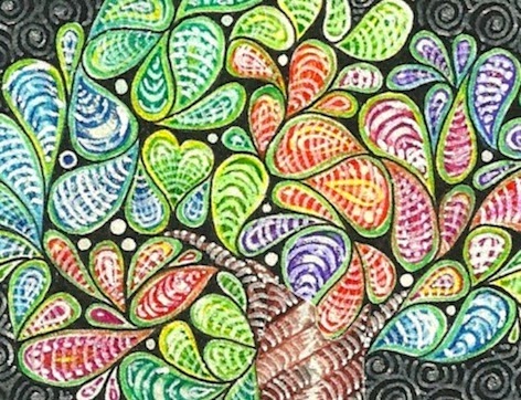
I had done a tree on a tile and quite liked it, but it was too subdued (read: dark), even with some of the brighter colors I'd used. I added white ink, in simple lines, over each of the droplet shapes. In some cases it really disguises what was there originally, but that's alright. The color is still there, and it's much brighter. I did the same thing on the bands of the trunk. Not really a tangle over a tangle, but the same idea.

Finally, here's a piece where the sky is Printemps in medium blue, overlaid with Tidings in dark blue. I used little circles instead of ovals in Tidings and filled them with gold ink. Then I used Tidings again in the foreground to give the same texture as the sky, helping keep the buildings distinct.
Tangles: Flukes, Groovy, N'zeppl, Printemps, Romanancy, Tidings
If you'd like to try this, there is an abundance of tangles composed mainly of lines that could be used. My favorites seem to be Printemps, Tidings, Dansk, Sand Swirl, and Tri-dots for something very minimal. Tri-dots with a lot of Auras would work too.

Other possibilities could be: Florz, Tipple, Munchin, Cheesecloth, Groovy, N'zeppl, Tips, Zewm, Hibred, Indy-rella, Yincut... I'm sure you'll think of others!

With different colors it's easy enough to keep the two tangles separate as you're drawing. With black and white you might want to try two pen sizes, or change the scale between the tangles, or use tangles that are different in nature such as Florz and Sand Swirl.

Have fun!

Wednesday, March 20, 2013

Box begone! (Diva challenge 110)

Woohoo! Permission to go wild! These tiles don't look wild at all, but I did try something I've been thinking about for a while. It's a technique used by colored pencil artists.  A design is impressed into the paper and when you draw over it with colored pencil the design is left white. Like this:
I wondered how that would work with tangles. I had two ideas. The first was to do it as described. The second was to impress the patterns and then go over the whole thing with water-soluable pencil. I expected the water (and color) would sink into the impressions and be darker. Once the patterns were visible I darkened selected areas.
Tangles: Firecracker, Giotto, Paisley Boa, Paradox, Tripoli, Whyz
Tangles: Coaster, Crescent Moon, Gneiss, Hollibaugh, Munchin, Providence
Well, the water idea didn't work very well! This whole concept might be better with color instead of gray, or in a larger size. The more detailed tangles are less successful.

If you want to try this (probably with colored pencils!) here are two methods:
  1. Use waxed paper and a hard lead (white) pencil. Put the waxed paper over your drawing paper and draw on the waxed paper, pressing reasonably hard so that you impress the drawing paper. Remove the waxed paper and, lightly at first, color over the designs on your drawing paper using the side of the pencil. The white pencil is just in case you break through the waxed paper. If you're careful you could use an ordinary hard lead pencil, I'd say 4H or harder. This method is what I used for the colored sample above.
  2. Use the pointy end of a compass to impress the designs directly into the paper. Depending on your paper, this may tend to tear or shred. Test first. This method is mainly what I used for the tiles above.
Having tried both I can tell you that it's much easier to do curving lines with the pencil and waxed paper than using the compass point. You could also try your thumbnail, an unbent paper clip, a pointy knife...
Compass with pencil and point, Verithin brand white pencil, and
waxed paper with some impressed designs.

And just for fun, INSIDE these boxes are some of the Zentangle tiles I've created over the past two years.


Friday, August 3, 2012

Rangolis

Photo from www.anandway.com
Rangoli is a folk art of India.  They are decorative circular designs made on the floors of living rooms, in courtyards and outside doors during Hindu festivals. They are intended as sacred welcoming areas for the Hindu deities and are thought to bring good luck. I understand that in some parts of India it's the job of the lady of the house to create a rangoli outside the front door or gate each day.

They can be quite simple, like the one above, or more involved like the one below. Often, they are drawn with moistened chalk, however, other materials can be used such as colored rice, colored dry flour, sand or even flower petals and leaves.
Photo from www.anandway.com
Colored chalk can be used too.
Photo from www.anandway.com
Here is a rangoli created using flowers.
Photo from Wikipedia
This reminds me of a video I posted a while ago about How to Grow a Mandala. I expect the drawing of the chalk rangolis/mandalas progresses in much the same way.

Friday, July 27, 2012

Early pen-and-ink trees

Here are a few more of my earlier pen-and-ink pieces. As you can see, I've always loved pattern, repition, and detail. I also like trees!

An illustration in a children's magazine:


Tuesday, July 3, 2012

String and nails portraits

Remember that string and nail art you did as a child? Artist Kumi Yamashita has taken that a whole lot further. Amazing work! To see more, see here.

Sunday, February 19, 2012

Stippling - a tutorial

Stippling is a delicate drawing technique with lovely results. In this technique the drawing is composed entirely of tiny dots. Some very impressive shading can be accomplished this way.

Drawing by Jayel Aheram on Flickr. Image licensed on Creative Commons.

Christine Farmer does a lot of pen and ink work using stippling. You can see examples of her work here. She says, "Stippling as a technique requires precision, skill, and concentration, and I like the fact that progress is necessarily slow and steady." Sounds rather zen, doesn't it?
Noli Novak frequently does illustrations for the Wall Street Journal employing this technique.

Image from Noli Novak's website

Some superb artwork can be created using only stippling. BUT... it can also be used in small amounts. It's a terrific way to achieve an effect in pen and ink that is other than black, white, or lines. Some time ago I tried a very simple Zentangle tile using only stippling. For the string I overlapped two 8s. There is no pencil shading.


CZT Donna Hornsby's tangle Keenees uses tiny dots... basically stippling. When stippling in Keenees you can go darker into the corners, like this:


I thought it would be interesting to do some Zentangle tiles entirely in stippling. I found it has a sort of misty look. I think I could be a little bolder with areas that could be more black. Both these next tiles were done using a 01 pen, with the exception of Zedbra on the left which was done with a 08 just to see the difference. I used pencil for the shading.
Tangles: Florez, Keenees, Lotus Pods, Tripoli, Zedbra.
Tangles: Dutch Hourglass, Flukes, Flux, Miranda, Paradox

Next, I tried a normally-drawn tile, but did all the shading using stippling. I still much prefer the effect of pencil, but stippling can be a good option for shading should you find yourself with only a pen.
Tangles: Cubine, Golven, Hibred, Pearlz, Unyun and stippling

HOW TO?
Simply use your Sakura Micron (or similar) pen, hold it vertically (not slanted) and with a light touch tap the pen tip on the paper. Many, many, many, many, many times. :-)
More dots in one place gives darker areas. Fewer dots, lighter areas. You can use different sizes of pen for varying effects. If an area is to be quite dark you may want to begin with a larger pen to fill space faster, then switch to a tiny pen for finishing.

There is a little more about stippling from Canadian CZT Geneviève Crabe on tanglepatterns.com here.

Finally, here's a two minute video showing the development of a portrait done entirely in stippling. Prepare to be amazed!


Hero from Miguel Endara on Vimeo.