![]() |
| Tangles: Crescent Moon, Doodah, Knase, Knightsbridge, Snail |
It nicely accommodates some of the blotches and irregularity.
![]() |
| Tangles: Crescent Moon, Doodah, Knase, Knightsbridge, Snail |
I have a long-standing interest in languages and linguistics and in color, so of course I'm curious about how various languages refer to colors. Here is a bit of what I've learned, paired with some more-or-less appropriate artwork!
![]() |
| Primitive languages have only two color words and they are for black and white, or - more accurately - dark and light. |
![]() |
| If a language has only three words for colors, they are for black, white, and red. This is because red is so closely associated with life and death. |
![]() |
| Color terms are added in a fixed order as a language evolves. Next to arrive are words for green and yellow, one or the other, and then the other. |
![]() |
| After yellow and green is blue. |
![]() |
As languages develop they next add |
![]() |
| (No, this isn't my art, but it gets the point across nicely!) Irish apparently has two words for green. Glas denotes the green color of plants and the gray-green of the sea, while uaithne describes the artificial greens of dyes, paints, and such. Apparently this distinction is made even if the hues are identical. It seems it's not so much about the color itself, but about how it came to be. |
![]() |
| And there you have a brief history of words for colors. |
Zentangle's Project Pack 12. The annual Twelve Days of Zentangle. This year, Zentangle Renaissance. It's taken me quite a while to find the time to do this project but all in good time. Aaand... here we go!
DAY ONE - Bronx Spear, an interesting tangleation of Bronx Cheer. My little pot of gold gouache was hard as a rock, so while waiting for it to reconstitute I used gold acrylic paint.
DAY TWO - In my book you can't go wrong with Crazy Huggins, and I love the idea of double DooDah in the horizontal ones.
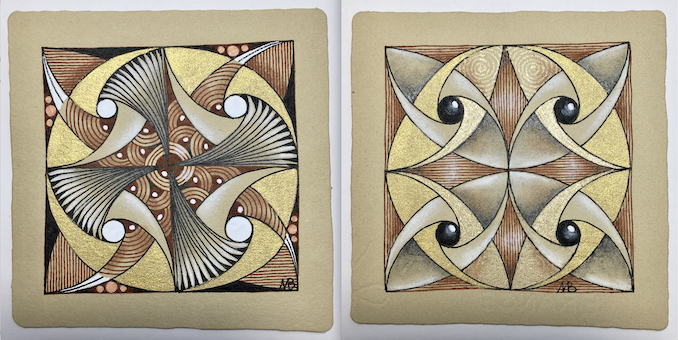
DAY THREE - This took a wrong turn right from the start when I did the four fragments all the same rather than turning them as I went. I kept going, wondering what delight would appear out of the 'oops', and it's one of my favorites! That's the first tile below. The second tile is my second try, and how it was "supposed" to go; I really like this, too, and hope to experiment with it more.
DAY FOUR - The idea was to do three of these, with a gold border along the entire bottom, then bend them at the center, glue the sides together, and have a lovely tiny conifer tree shape. My gold ended up in a corner, and I only did the one.
DAY FIVE - Aura'd Fife, "tethered" Auras, a coffered border, and more. I realized that Fife with the inner Auras is a lot like Double Double without the initial square grid. I like the idea of white chalk rings but mine didn't work well.
DAY SIX - We used four bijou tiles, four overlapping hearts and the tangle Scena.
DAY SEVEN - We began with a light gold wash over the entire paper (gorgeous!), then added Paradox, Pearlz, and Flux. I also used Paisley Boa immediately beside Pearlz.
DAY EIGHT - We started with a pre-strung zendala tile, and then completely ignored the string to create the border! I wanted to preserve a little more of the pre-strung design so I left the star points visible. My gouache still wasn't smoooooth so I used a lot of different metallics in the center: gold acrylic paint, copper acrylic paint, gold gel pen, copper gel pen, and clear star gel pen.
DAY NINE - On a phi tile, a Purk/Festune mashup, Pearlz, Stiritup, and more. I really like the phi tiles.
DAY TEN - On a 3Z tile, some paisley-like, moon pie-ish shapes. and a gold border. My gold gouache is somewhat reconstituted so I used it, but it's still very grainy.
DAY ELEVEN - The tangle Drawings on a zendala tile. I couldn't get the shadow as dark as I wanted even with a 6B pencil so I added tiny wavy lines in black.
DAY TWELVE - On a square tile, we began with Mi2. Then we added Auras,"capes" :), and "therefores" (AKA Tridots, or cinta marta?)
Many thanks again to those at Zentangle HQ for another fun project pack!
I was out walking the other day and noticed an interesting hubcap. Then I noticed other hubcaps. What wonderful inspiration for mandala designs! Simply plug "hubcap photos" into an image search engine and you'll find lots of inspiration! Here are five, along with the hubcap that inspired them.
![]() |
| Tangles: Black Pearlz, Doodah, Fife, Hibred, Prestwood, Skyesil, Zewm |
![]() |
Revisiting the golden mean through Project Pack 11 was such fun I wanted to do more!
The pack contains a "markus operandus" for locating the phi proportions on Zentangle tiles. Markus Operandus II can be downloaded here, for free, at the bottom of the page. I've added marks to mine so I don't have to rotate my paper in order to indicate all the phi lines. I may have it laminated. It looks like this.
It can be used not only with the new Phi tiles, but also with the classic square (also apprentice and bijou) tiles, as well as the triangular 3Z tiles. I wanted to give them a whirl.
The proportions work on a square just as well as a rectangle. I'd done this years ago when my focus was mandalas. With the mandalas I used all four phi lines to create the working space:
Here's a mixed media painting from that time using these phi ratios.
| Pro Fanis • ©1998 30" (76 cms) square; acrylic and collage |
I've been fascinated with sacred geometry and the golden mean for many years. Delighted to revisit it in this project pack, I created a number of square tiles.
Using the same four lines as above I did a classic-size tile. You can see Hollyhock in the corners, Icantoo in the rectangles, and the center connects it all.
![]() |
| Tangles: Hollyhock, Icantoo, and hints of Crescent Moon, Pearlz, and Sanibel |
I had a gray tile with a mauve wash. It struck me that somewhere near the 'center' of the flower shape might be a phi intersection. Here is the finished tile, with backwards steps to the mauve wash.
![]() |
| Tangles: Aquafleur, Pearlz, Pokeleaf |
This is an eco-dyed tile that I subdivided into various phi-measured sections. I used Moonlight pens and gold ink as well as brown and sepia micron pens.
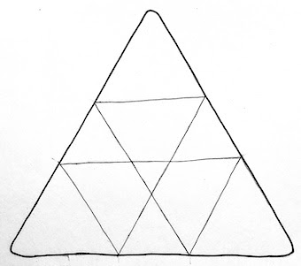
But triangles? The kit says it works with triangles, too. I don't see why not, but I'd never thought to try it before. On a rectangular shape, there are four phi intersections (shown above). I discovered that with a triangle, there are three.
The black and white 3Z tile below has the tangle Ayame, but instead of beginning it at the center I began at one of the intersections. On the tan tile, I used the six notches at the perimeter as places to begin the droplet shapes.
I'm grateful to Zentangle for reintroducing me to divine proportion. I plan to do a lot more with these measurements.